Hitit — Enterprise Aviation Systems
Designing forcomplex aviation systems
Crane is Hitit's suite of airline systems. This collection shows interfaces I designed for three of them — loyalty, departure control, and weight & balance — where the work is making complex, information-dense workflows easier to read and act on.
My contribution: interface design for three products in Hitit's Crane suite — Crane LL, Crane DCS and Crane WB — across desktop, tablet and mobile.
- 02Crane LLLoyalty
- 03Crane DCSDeparture Control
- 04Crane WBWeight & Balance
02 — Crane LL
Loyalty
One view of the customer, for the people who manage loyalty members.


The customer summary brings the member's details, loyalty balance, points expiring and membership card into a single row, with upcoming flights and their status below. Personalised messages run down the side — account locked, missing address, a birthday, an offer — so issues and opportunities surface without searching.
The welcome screen organises the system into operational modules — Customer Management, Enrolment, Customer Unification, Personalization, Business Intelligence and Report — beside a news feed.
On mobile, the same summary and personalised messages stack into a single column.
Design system
One library behind every screen.
A shared library of type, colour, buttons and states, inputs, icons and message cards keeps every screen consistent.

03 — Crane DCS
Departure Control
Interfaces for passenger and flight processing at the airport.
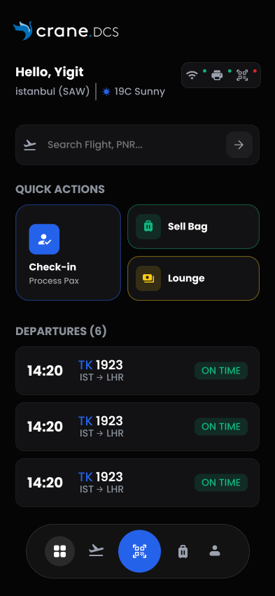
Departures, device status and the main operations — Smart Scan, Check-in, Sell Bag, Payment — on one tablet screen.
Mobile
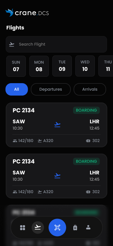
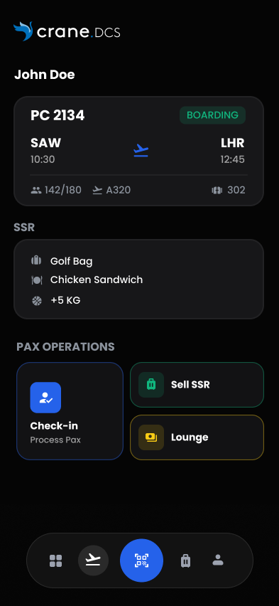
On the phone, the same work becomes a three-step sequence.
01 Home
02 Flights
03 Passenger


04 — Crane WB
Weight & Balance
A mobile tool for load control, in light and dark.
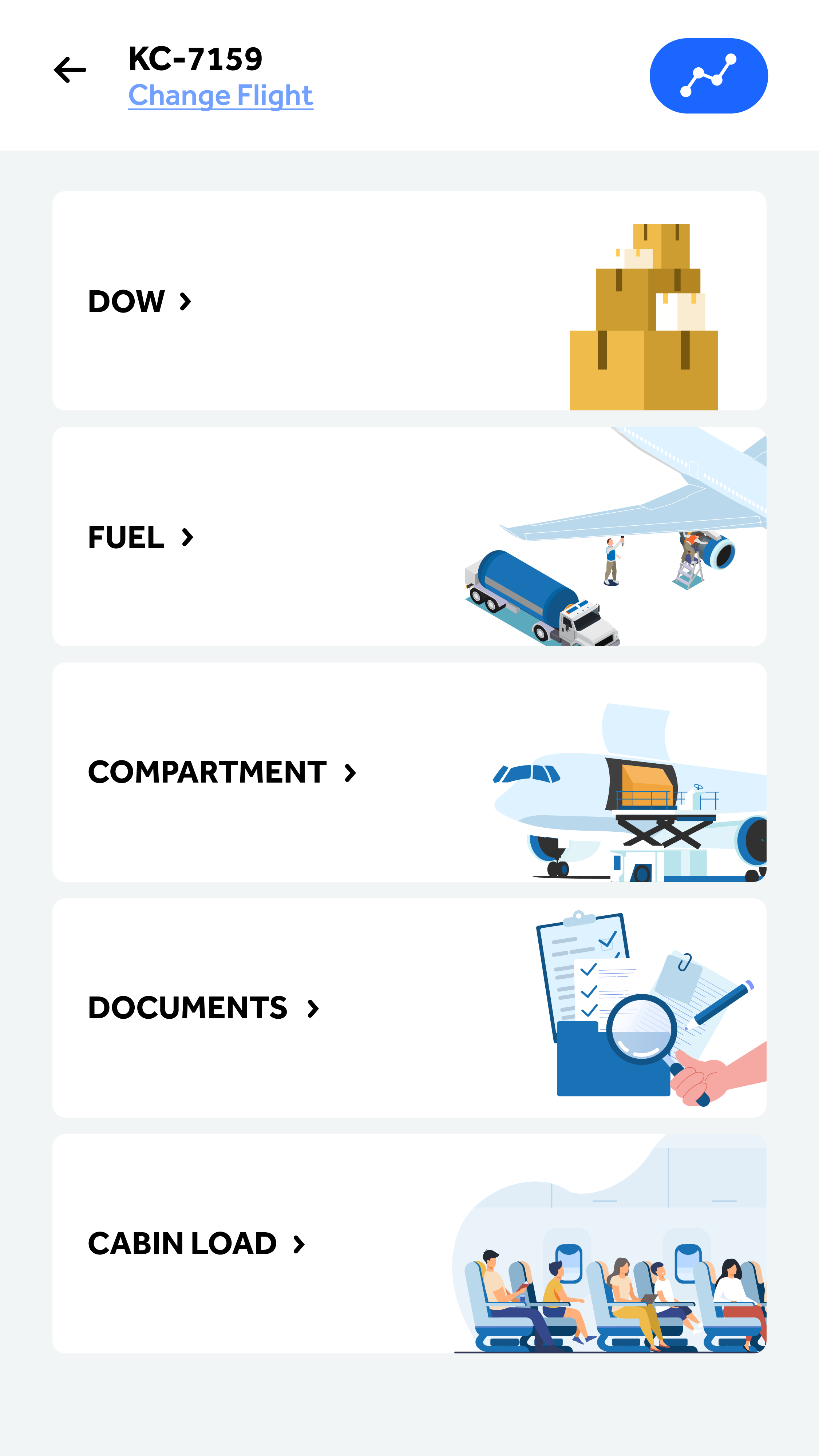
- DOW
- Fuel
- Compartment
- Documents
- Cabin Load
After choosing a flight, the work is split into five illustrated cards — DOW, Fuel, Compartment, Documents and Cabin Load — so each part of the calculation has its own entry point. Flight lists support assigning, removing and updating flights, and recently operated flights are one tap away.
Every screen exists in a light and a dark variant.


Dense information, made clear enough to act on.
Three products, three operational contexts — one aim: put what someone needs to decide first, and keep the rest within reach.
Air Samarkand
A mobile booking app — design proposal